
The Silent Anxiety of Staring at Red and Green Bars
You open a cryptocurrency app on your phone, hoping to see your portfolio grow. Instead, you are greeted by a chaotic screen filled with blinking red and green lines.
They jump up and down like a heartbeat monitor in a hospital room. You feel your chest tighten as you try to make sense of the chaos.
Everyone on social media seems to know exactly what these shapes mean. They talk about "bullish trends" and "market support" with absolute confidence.
Meanwhile, you feel like you are looking at a foreign language without a dictionary. You want to make smart moves, but right now, you are just guessing.
This guessing game is not just stressful; it can also cost you your hard-earned money. Many beginners buy when they see a big green bar, only for the price to crash seconds later.
Others panic and sell during a red dip, missing out on a massive recovery. This emotional roller coaster ruins your sleep and keeps you constantly checking your phone.
You do not need to be a math genius to understand how these charts work. Once you learn to read the simple shapes, the market starts telling you a very clear story.
Let us pull back the curtain on this mysterious language together, step by simple step.
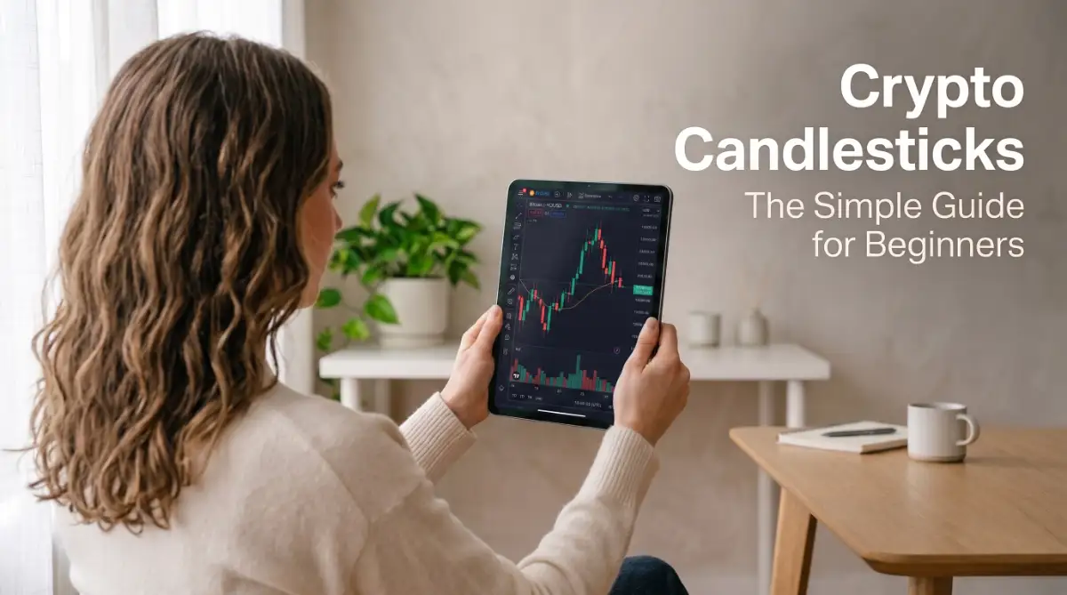
What Is a Candlestick Chart Anyway?
Before we look at the shapes, let us understand what a candlestick chart actually represents.
A standard line chart only shows you the closing price of an asset over time. It connects the dots to make a smooth line, but it hides all the action that happened in between.
A candlestick chart is different because it shows you four different pieces of information in a single look. It acts like a detailed diary of how buyers and sellers fought over the price during a specific time.
This charting method was actually created hundreds of years ago by Japanese rice traders. They wanted a smart way to track market momentum and predict future price movements.
Today, this same system is the foundation of modern cryptocurrency trading. It works because human psychology does not change, whether we are trading rice or Bitcoin.
Anatomy of a Crypto Candlestick: The Four Key Points
To read a candle, you only need to look at three main parts: the color, the body, and the wicks.
The thick, middle part of the candle is called the real body. This block shows you the price range between where the market opened and where it closed.
The thin lines stretching out of the top and bottom of the body are called wicks or shadows. These thin lines tell you how high and how low the price went during that time.
Every single candle tracks a specific time frame that you choose on your screen. If you select a 1-day chart, then each candle represents exactly 24 hours of market activity.
If you select a 1-hour chart, each candle shows you the price movement for just one hour. Within that hour, the price will form four specific price points:
- Open: The price of the cryptocurrency when the new candle started.
- High: The highest price point the cryptocurrency reached during that candle's time.
- Low: The lowest price point the cryptocurrency touched during that candle's time.
- Close: The final price of the cryptocurrency when the candle's time ended.
Understanding these four points is the first step to feeling confident when looking at any crypto market.
Green vs. Red: Who Won the Battle?
The colors of the candles tell you instantly who won the battle between buyers and sellers.
A green candle forms when the closing price is higher than the opening price. This means buyers were in control and pushed the price up during this time frame.
For a green candle, the open price is at the bottom of the body, and the close price is at the top. The top wick shows the highest jump, while the bottom wick shows the lowest drop.
A red candle forms when the closing price is lower than the opening price. This shows that sellers were dominant and pushed the price down.
For a red candle, the open price is at the top of the body, and the close price is at the bottom. The wicks still represent the highest and lowest points reached during that period.

By looking at the color, you immediately know which group is carrying the market momentum.
The Secret Language of Candle Wicks
Now that you know the body, let us look at the wicks, which often hold the most important clues.
Wicks represent rejection. They show you that the price tried to go somewhere, but the other side pushed it back.
Imagine a candle with a very long wick on top and a very small body at the bottom. This tells you that buyers tried to push the price really high, but sellers stepped in and forced the price back down.
This is a sign of weakness, suggesting that the upward trend might be losing steam.
Now imagine the opposite: a candle with a very long wick at the bottom. This means sellers tried to crash the price, but buyers rushed in to buy the dip, pushing the price back up.
This long bottom wick is often a sign of strength, showing that there is strong support at lower prices.
When you start reading the wicks, you stop looking at just colors and start seeing the actual pressure of the market.
Setting Up Your First Free Charting Tool
You do not need to pay for expensive software to start practicing your new skills.
The most popular tool used by millions of traders worldwide is TradingView. It is completely free to use for basic chart reading and works on any web browser.
Once you open the website, type in a popular cryptocurrency like BTC/USD or ETH/USD in the search bar.
Next, look at the top menu bar and make sure your chart type is set to Candles instead of a line.
After that, locate the timeframe selector next to the symbol name. Set this to 1D (1 Day) to give yourself a clean, slow-moving view of the market.
Avoid lower timeframes like the 1-minute or 5-minute charts when you are just starting out. Those short timeframes move too fast and contain too much noise, which can easily confuse a beginner.
Why the Daily Chart Is Your Best Friend
Many new traders make the mistake of jumping straight into fast charts to make quick trades.
They watch the 5-minute candles blink, which leads to emotional decisions and quick losses.
If you want to keep your mind calm, always start your analysis on the daily chart.
The daily chart filters out the daily market noise and shows you the true, underlying trend.
If the daily candles are mostly green and making higher bodies, the overall market is moving upward.
If the daily candles are mostly red and heading downward, you know it is a downtrend, regardless of what is happening on the 5-minute chart.
Staying on higher timeframes builds your patience and helps you develop a realistic view of market movements.
Common Mistakes Beginners Must Avoid
When you first learn about candlesticks, it is easy to get overconfident and make simple errors.
The biggest mistake is trading based on a single candle without looking at the bigger picture.
One green candle does not mean a market crash is over, and one red candle does not mean a bull run is dead.
Always look at the group of candles preceding the current one to understand the context.
Another mistake is forgetting that a candle is not final until its timer actually runs out.
A candle can look extremely green and strong five minutes before it closes, but it can turn completely red by the time the hour ends.
Always wait for the candle to close before making any final decisions or drawing conclusions about who won the battle.
Moving Forward with Your Chart Reading Journey
Learning to read candlesticks is like learning to ride a bicycle.
It feels slightly awkward at first, and you might have to think about every single step.
With just a little bit of daily practice, your eyes will naturally start recognizing these patterns without effort.
You will look at a chart and instantly see where the buyers are waiting and where the sellers are losing control.
This knowledge replaces anxiety with logic, helping you make decisions based on data rather than fear.
Keep your charts clean, stay patient on the daily timeframes, and let the candles tell you their story.
Moving Beyond the Basics: How to Spot Strong Market Secrets
Once you understand the basic green and red candles, you are ready to look at how they work together. The market does not move in a straight line, and single candles can sometimes play tricks on you. To find the truth behind the price, we must look at how candles behave in groups and combine them with other tools.
The absolute best way to verify if a candlestick is telling the truth is by looking at trading volume. Volume is the total amount of a cryptocurrency traded during a specific timeframe, and you can usually find it at the very bottom of your chart. Think of volume as the fuel that drives the engine of a price movement.
If you see a massive green candle with very high volume, it means a huge number of people are actively buying. This shows real strength and suggests the upward move is healthy and likely to continue.
On the other hand, if you see a large green candle but the volume bar is tiny, you should be careful. This tells you that only a small group of people are pushing the price up, which often leads to a sudden drop. You can read more about how volume confirms price trends on Binance Academy, which offers deep insights into market dynamics.
It is incredibly easy to get lost in the tiny movements of the market. To keep your head clear, you must learn the art of multiple timeframe analysis. This simply means checking the daily chart first before you look at shorter timeframes like the 4-hour or 1-hour charts.
Imagine you are looking at a painting on a wall. If you stand one inch away from the canvas, you only see messy brushstrokes and lose all context. But when you step back to the middle of the room, you can see the beautiful image clearly.
The daily chart is your step back to see the whole picture. If the daily trend is pointing down, a quick green candle on the 1-hour chart is likely just a temporary bounce. Always align your short-term observations with the long-term trend to protect your capital.
Sometimes, neither the buyers nor the sellers can win the daily battle. When this happens, a very special candlestick called a Doji forms on your chart. A Doji candle looks like a cross or a plus sign because it has a tiny body with long wicks on both sides.
This shape tells you that the price opened and closed at almost the exact same level. The buyers tried to push the price up, and the sellers tried to drag it down, but they ended in a tie.
When you see a Doji after a long upward run, it is a warning sign that the buyers are getting tired. It does not mean you should panic, but it tells you to pay close attention because a trend change might be coming soon.
Another highly reliable shape that beginners should look for is the Hammer candle. This candle has a very short body at the top and a long lower wick that is at least twice the size of the body. It looks exactly like a household hammer.
This shape usually appears at the end of a long downtrend. The long lower wick shows that sellers pushed the price very low, but buyers stepped in with massive force to rescue the asset before the candle closed.
Finding a hammer candle on a daily chart is a great way to spot potential trend reversals. It shows you that the market is rejecting lower prices and might start moving upward.

The Hidden Traps That Drain Beginner Accounts
Learning to read charts is exciting, but the crypto market can be unforgiving if you fall into common mental traps. Many beginners lose their savings not because they do not understand candles, but because they let their emotions make their trading decisions.
We have all felt that sudden rush of excitement when we see a massive green candle shooting upward. Your brain starts telling you that you are missing out on easy profits, a feeling widely known as FOMO. You buy near the very top of that candle, hoping it will keep rising forever.
Unfortunately, this is exactly when the early buyers decide to take their profits. The moment you click buy, the candle begins to shrink, leaving you with a loss.
Never buy an asset that is already in the middle of a vertical green spike. It is always safer to wait for the market to cool down and form a stable base before you put your money at risk.
The opposite of chasing green candles is trying to buy during a massive market panic. You see a series of huge red candles, and you decide to buy because the price seems incredibly cheap.
This is highly dangerous and is often called "trying to catch a falling knife." Just because a coin has dropped fifty percent does not mean it cannot drop another fifty percent tomorrow.
Instead of guessing where the bottom is, wait for the red candles to get smaller. Look for bottom wicks, Dojis, or Hammer patterns that prove the selling pressure is actually stopping. To learn more about managing your emotional decisions during these volatile phases, read our guide on managing crypto risk before making your first purchase.
Cryptocurrencies do not move in isolation; they move in large waves called market cycles. If you only look at daily candles, you might miss the fact that the entire market is in a long-term bear phase.

During a bear market, even the strongest-looking green candles are often temporary traps designed to lure in buyers. Understanding where you are in the overall cycle will save you from making costly mistakes. To build a solid foundation on how these major shifts work, take a look at our article on understanding market cycles.
When you first learn technical analysis, you might feel tempted to analyze every single line and shape on your screen. You start drawing dozens of lines and adding complicated indicators until your chart looks like a spider web.
This leads to a state called analysis paralysis, where you get so confused by conflicting signals that you cannot make a decision. Keep your charts as clean as possible.
A simple chart with just candlesticks and volume is always more powerful than a cluttered screen. Trust the clean price action over complicated mathematical indicators that lag behind the real market.
Your Action Plan for Safer Market Exploration
Now that you have the basic keys to read candlestick charts, you have a major advantage over most beginners. You no longer have to look at the market with fear or confusion. You can view the candles as a map that shows you the footprints of big institutional money and retail traders alike.
To turn this knowledge into a practical skill, here is your simple checklist for tomorrow:
- Step 1: Open a free account on TradingView to practice your chart setup.
- Step 2: Choose a major coin like Bitcoin or Ethereum and set your chart timeframe to the daily (1D) view.
- Step 3: Look back at the last three months and try to find at least three Hammer candles at the bottom of dips.
- Step 4: Check the volume bars below those candles to see if the buying pressure was supported by real volume.
- Step 5: Read through our comprehensive guide on basic crypto terms to make sure you understand the vocabulary used by other traders.
Do not worry about making perfect predictions right from the start. Your only goal right now is to observe, learn, and build your confidence slowly.
The market will always be there, and it will always offer new opportunities to those who are patient enough to study the charts. Keep practicing, protect your peace of mind, and let the candles guide your journey into the world of cryptocurrency.
Disclaimer
This blog post is created strictly for educational and informational purposes only. The content shared here does not constitute financial, investment, or trading advice. Cryptocurrency markets are highly volatile and carry a significant risk of financial loss. Always conduct your own thorough research, practice on demo accounts, and consult with a licensed financial advisor before investing any real money into the market.


