The Blur of Big Dreams: Why Your Gorgeous AI Art Looks Terrible on Paper
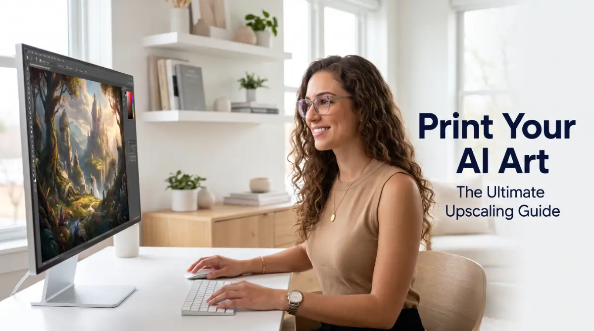
You sit at your desk, staring at your computer screen with pure joy. The AI art generator just gave you the perfect image after hours of tweaking prompts. It has the right colors, the perfect lighting, and an emotional depth that speaks to you.
You decide this piece belongs on your living room wall. You want to feel the texture of the paper and see the colors pop in real life. So, you save the file and send it to a local print shop.
A day later, you hold the physical print in your hands, but your heart instantly sinks. The sharp, stunning details on your screen now look like a blurry, blocky mess. The smooth lines are jagged, and the faces look muddy.
It is incredibly frustrating to waste your time, effort, and hard-earned money on a print that you cannot even hang up. This painful moment happens to almost everyone who tries to print AI-generated images for the first time.
The main issue is that most AI tools only create small, low-resolution files to save computer processing power. These files look great on your phone or laptop but fall apart when stretched onto physical paper or canvas.
Fortunately, you do not have to settle for blurry prints or give up on your physical art projects. There are simple, reliable ways to make your digital creations sharp enough for any frame.
Decoding the Print Quality Problem: Pixels vs. Dots Per Inch
To solve this issue, we need to understand how screens and printers talk to each other. Screens use pixels to show images, while printers use tiny dots of ink.
When you look at a digital image, you see Pixels Per Inch (PPI). When you print that same image, the printer translates those pixels into Dots Per Inch (DPI).
To get a sharp print, the gold standard is 300 DPI. This means the printer needs 300 pixels of digital information for every single inch of paper.
If you try to print an image at a lower density, like 72 DPI, the printer has to stretch the existing pixels. This stretching is what causes the ugly blocky squares and fuzzy edges.
Let us look at a quick real-life example of how this math works in your daily printing projects.
Most default AI images from Midjourney or DALL-E are about 1024 x 1024 pixels in size. If we apply the 300 DPI rule, we divide 1024 by 300.
This means your raw AI image can only be printed at a tiny 3.4 x 3.4 inches before it starts losing quality. That is barely the size of a sticky note.
If you want a beautiful 12 x 12 inch print for your wall, you actually need an image that is at least 3600 x 3600 pixels.
Our main goal is to bridge this huge gap between the small original file and the large size needed for physical prints.

Myth vs. Reality in Image Upscaling
- Myth: You can just open a small image in paint and change the print settings to 300 DPI to make it high quality.
- Reality: Simply changing the DPI number does not add new detail; it only tells the printer to stretch the same small image.
- Myth: AI upscalers can perfectly recreate a missing face or tiny text from a blurry background.
- Reality: AI upscalers make smart guesses based on existing patterns, but they cannot recreate lost details out of thin air.
Smarter Ways to Resize Your Art Without Losing Quality
Now that we know the math, let us look at the best ways to grow your images without making them look bad. We have a few different paths we can take depending on your budget and computer skills.
Path 1: Using Dedicated AI Upscaling Software
The most effective method is using software built specifically to grow images using smart neural networks. These tools do not just stretch pixels; they actually analyze the shapes in your image and draw new pixels to fill the gaps.
One of the most popular desktop programs for this task is Topaz Gigapixel AI. It is a favorite among professional photographers and digital artists.
When you load your image into Gigapixel, the software recognizes faces, hair, textures, and landscapes. It then rebuilds those specific areas so they stay sharp even when made six times larger.
If you prefer a completely free and open-source option, you should look at Up scayl. It is a great desktop application that runs on Windows, Mac, and Linux.
Upscayl uses powerful AI models on your own computer to clean up and enlarge your art without any subscription fees. It is simple to use and does not upload your private images to the cloud.
For quick projects, there are also web-based tools like VanceAI or Let’s Enhance. These websites let you upload an image, click a button, and download a larger version in seconds.
However, online tools often limit how many free images you can process before you have to pay. They are great for occasional use but can get expensive for larger art projects.
Path 2: Traditional Image Editors with Smart Resampling
If you already own Adobe Photoshop, you have a built-in way to upscale your images using smart algorithms.
Inside Photoshop, when you open the Image Size window, you will see a dropdown option called Resample.
Instead of using the basic "Bicubic" options, you should select Preserve Details 2.0. This is Adobe’s advanced tool that uses machine learning to keep edges sharp and reduce noise.
You can also use the Reduce Noise slider within this tool to smooth out any unwanted grain that appears during the enlargement process.
For those who use the free program GIMP, you can use the Sinc (Lanczos 3) interpolation method when scaling your images.
While traditional editors are not as advanced as dedicated AI upscalers, they are still a solid option if you want to keep your workflow in one place.
Path 3: Converting Graphic Style Art into Vector Paths
Sometimes, your AI art is not a realistic photo but a clean logo, cartoon, or simple illustration. If your image has flat colors and bold outlines, upscaling pixels might not be the best choice.
Instead, you can convert the entire image into a vector format like an SVG file.
Unlike regular pixel images, vector images use mathematical paths, points, and curves to draw shapes. This means you can scale a vector image to the size of a billboard, and it will stay perfectly sharp.
You can use Adobe Illustrator’s Image Trace tool to convert your flat AI art into clean vector shapes.
There are also free online converters like Vectorizer.ai that do an incredible job of turning color illustrations into clean vector files.
Remember, this vector method does not work well for highly detailed fantasy art or realistic photography, as it will make them look like simplified cartoons.
Setting Up Your Files for the Perfect Print
Getting a high-resolution file is only the first half of the battle. You also need to make sure the file format and color settings match what printers actually use.
Choose the Right File Format
When you save your newly upscaled image, avoid using the JPEG format if you plan to do more editing.
JPEG files use "lossy" compression, which means they throw away small bits of visual data every single time you save the file. Over time, this makes your image look muddy again.
Instead, save your final artwork as a TIFF or PNG file.
TIFF files are larger, but they keep every single pixel intact, making them the absolute best choice for professional printing shops. PNG is also a great option because it offers clean, lossless compression.
Understand the Color Shift (RGB vs. CMYK)
This is a step that catches many beginners off guard. Your computer screen displays colors using red, green, and blue light, which is known as the RGB color space.
Printers, however, use four physical inks: cyan, magenta, yellow, and black, known as the CMYK color space.
Because physical inks cannot glow like a computer screen, some extremely bright neon greens, pinks, and blues will look duller on paper.
To prevent this surprise, you can convert your image to CMYK inside an editor like Photoshop to see how the colors will look when printed.
If you notice the colors look too dull, you can manually adjust the saturation and contrast before sending the file to the printer.
Pro Tip: Always ask your print shop for a physical "proof print" before ordering a large, expensive canvas. A small test print on a regular sheet of paper will help you spot color errors or pixelation problems before spending your budget.
Easy Steps to Clean Up Your AI Art Today
If you want to upscale an image right now, here is a simple workflow you can follow to get the best possible results.
First, open your low-resolution AI art in a free tool like Upscayl or a paid option like Gigapixel AI.
Select the 4x upscale option, which will turn a standard 1024-pixel image into a large 4096-pixel image.
Next, choose a model that fits your image style. If your art is a painting, choose a model that preserves soft brush strokes; if it is a photo, choose a model that enhances realistic details.
Once the upscaling is done, open the new file in an image editor to inspect the details. Look closely at eyes, hands, and text to make sure the AI did not create strange shapes or artifacts.
If everything looks clean, check the image size properties to confirm that your pixel dimensions match your target print size at 300 DPI.
Finally, export the image as a high-quality PNG or TIFF file, and you are ready to send it to your local or online print shop.
By taking these extra steps, you ensure that your physical prints look just as beautiful, sharp, and professional as they did on your screen.
Secrets from the Printing Studio: How to Achieve Gallery-Grade Quality
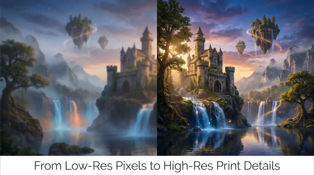
Once you know the basics of image sizes, it is time to look at what professional printmakers do. They do not just slide a scale up and send the image directly to a printer. They use specific tricks to make sure the final paper print looks like a museum piece.
One of the biggest issues with AI-generated art is the "plastic look." Because AI models work by smoothing out pixels, large flat areas like skin, sky, or walls can look artificially clean. When printed, this lack of texture makes the artwork look cheap and synthetic.
To fix this, professional digital artists use a technique called micro-texture injection. Before they do their final export, they add a incredibly thin layer of digital noise or photographic grain.
To try this yourself, open your upscaled image in an editor like GIMP or Photoshop. Create a new blank layer on top of your artwork and fill it with fifty percent gray. Go to the noise filters and add a tiny amount of uniform grain, usually around one or two percent.
Set the blend mode of that top layer to Overlay and drop the opacity until you can barely see it. This tiny step breaks up the artificial smoothness of the AI generator. When the physical ink hits the paper, it clings to these tiny patterns, creating a beautiful depth.
Another trade secret is the double-pass sharpening method. When you make an image larger, the edges can become slightly soft or blurry. If you sharpen the whole image at once, you might get ugly white halos around your dark outlines.
Instead, use a High Pass filter on a duplicate layer of your image. Set the radius to a small number, like one or two pixels, and change the layer blend mode to Soft Light. This target method only sharpens the actual edges of your shapes, leaving your smooth backgrounds perfectly clean.
Feeding your printer clean, high-quality files is like feeding your body clean fuel. You can think of it as how why whole foods are your liver's best natural defense works to keep your internal systems running smoothly.
Mastering the Art of Soft Proofing
When you want to print your work, you must learn to preview how the ink will behave on paper. This process is called Soft Proofing, and it allows you to see color changes before you use any physical ink.
Every professional print shop uses specific color profiles for their papers. You can visit the official International Color Consortium website to learn how these standardized color profiles keep prints looking consistent across the globe.
You can ask your printing provider for the ICC profile of the exact paper you plan to buy. Once you install this profile on your computer, your image editor can simulate how the paper absorbs the colors.
For example, warm cotton papers will make your cool blues look slightly greener. If you see this color change on your screen beforehand, you can adjust your file to keep the colors true.
If your digital canvas has small, ugly blemishes from the upscaling process, they will show up clearly on paper. It is similar to how simple daily habits can ruin your skin, like the 7 daily skincare mistakes making your acne breakouts worse that people often do without realizing.
Just like learning how to safely start intermittent fasting requires a structured, step-by-step approach for your body, preparing an image file requires a disciplined routine. Taking your time to inspect the fine details ensures your physical print turns out beautifully.
Understanding Different Paper Styles
The surface you choose to print on will change how your upscaled AI image looks in real life. Not all papers are created equal, and matching your art style to the right paper is a true pro-level skill.
Matte Cotton Rag Paper
This paper has a flat, non-reflective surface and is made from natural cotton fibers. It is perfect for fantasy art, watercolor styles, and vintage portraits because it gives a soft, organic feel. The paper texture absorbs ink deeply, which creates incredibly rich black tones and soft transitions.
Glossy Metallic Paper
If your AI art has glowing lights, neon colors, or futuristic sci-fi scenes, this is the paper to choose. The metallic coating reflects light in a way that makes bright colors look almost three-dimensional. However, avoid using this for soft portraits because the high reflections can make faces look unnatural.
Satin and Lustre Paper
This option is the middle ground between matte and glossy surfaces. It has a very gentle sheen that shows off sharp details without creating blinding reflections. Many print shops recommend lustre paper as the safest choice for general digital art prints.
Hidden Traps: The Costly Mistakes That Ruin Your Physical Art
Many creators jump straight from upscaling to ordering their prints without checking for common traps. This haste can lead to a pile of ruined posters and wasted budget.
One of the most common issues is aspect ratio mismatch. AI tools often generate images in perfect squares, like a one-to-one ratio.
However, standard frames and print papers usually come in rectangular shapes, like four-to-six or eight-by-ten. If you do not crop your image yourself, the print shop software might do it automatically.
This automatic cropping can cut off the top of a character's head or ruin the balance of your entire design. Always crop your upscaled file to the exact dimensions of your target paper before you export it.
Another hidden trap is over-sharpening. It is easy to think that more sharpness always equals a better print.
But when you push the sharpening sliders too far, you create sharp white edges and artificial speckles. These artifacts might look acceptable on a tiny phone screen, but they look terrible when printed on a large canvas.
You should also look out for chromatic aberration, which is a technical term for strange purple or green outlines around high-contrast edges. Many AI upscalers create these color halos by mistake when trying to define sharp borders.
Take a moment to zoom in to one hundred percent on your screen and sweep across the entire image. Look for any strange visual errors, digital noise, or smudges that the AI upscaler might have generated.
It is far better to find these small errors on your computer screen than to discover them after spending fifty dollars on a large physical poster.
Your Next Steps: From Digital Screen to Physical Masterpiece
Taking your first steps into the physical art world is an incredibly rewarding journey. There is nothing quite like seeing your digital concepts hanging on a wall for everyone to enjoy.
By taking control of your pixels, DPI, and upscaling tools, you can turn any low-resolution AI file into a professional-grade print. You do not need expensive corporate setups to get amazing results.
Start by downloading a free upscaler like Upscayl and test it on a few of your favorite images. Run some small test prints at your local shop to see how your colors translate from screen to paper.
Every mistake you make is just a lesson that helps you understand your tools better. Over time, you will develop an eye for detail that makes your physical prints look absolutely flawless.
Your Action Plan for Tomorrow
To make sure your next printing project is a complete success, use this quick checklist before you send your files to the shop:
- Double-Check the DPI: Ensure your pixel dimensions allow for at least 300 DPI at your target print size.
- Inspect the Edges: Zoom in to one hundred percent and check for any weird artifacts, smudges, or colored halos.
- Add Mild Texture: Blend in one percent of digital noise to break up any plastic-looking surfaces.
- Verify the Aspect Ratio: Crop your file to match the exact physical dimensions of your frame.
- Export to Lossless: Save your final file as a TIFF or PNG to keep your details completely clean.
Now, take your favorite AI creation, run it through your new upscaling routine, and bring your digital vision into the physical world today.
Disclaimer
This guide is for educational purposes to help digital creators understand printing and upscaling concepts. Results can vary based on the quality of your original AI image, the specific software models you use, and the equipment at your local print shop. Always consult with your printing professional for specific paper and color recommendations.